Abstract
Both policy makers and health care regulators require measures to reveal instances of poor care. Both in-hospital mortality and mortality within 30 days of admission are commonly used measures to reveal the number of ‘excess deaths’. However, all models contain hidden assumptions which can invalidate the model. In this instance, all current approaches to hospital mortality make the assumption that there are no large spatiotemporal events capable of creating disparate effects in time and place in both all-cause mortality in general, and hospital mortality in specific. The study of international trends in deaths, does however, reveal one such large an unexplained effect against deaths, which also appears to simultaneously affect medical admissions, i.e. both the numerator and denominator in the models are subject to unexplained forces. The action of these forces upon all-cause mortality in England is demonstrated, along with evidence for spatiotemporal variation in age-standardised mortality within 30 days of admission for myocardial infarction across various locations and organisations in England. Cyclic and parallel movement in both all-cause mortality and SHMI are demonstrated in Milton Keynes, Ipswich and Northampton hospitals. An identical situation is demonstrated at the Wigan Royal Infirmary for HSMR. Finally the potential contribution of these events to the ‘excess’ deaths at the Mid Staffordshire hospital are investigated. It would appear that hospital mortality models do indeed contain a ‘fatal’ flaw which severely limits their ability to detect true instances of excess hospital mortality.
Key words
Hospital Standardised Mortality Rate (HSMR), Standardized Hospital Mortality Indicator (SHMI), Medical admissions, Emerging infectious diseases, England, Moving rectangular wave, Spatiotemporal studies
Introduction
Following the Mid Staffordshire Hospital scandal in England (where financial targets were given priority over patient care and safety), and the ensuing Francis report into standards of patient care [1], there has been considerable debate in the UK regarding the use of different measures of hospital mortality in order to detect hospitals which may have poor processes of care, leading to otherwise avoidable deaths.
Two such measures are widely used, namely, hospital standardised mortality rate (HSMR) using a method developed by Dr Foster Intelligence [2], and the standardised hospital mortality indicator (SHMI) developed by the University of Sheffield at the request of the Department of Health [3,4]. SHMI also includes deaths within 30 days of discharge, includes a wider range of conditions, and uses a different methodology to HSMR. See Table 1 for a summary of the key differences.
A Dutch study found that in-hospital mortality (HSMR equivalent) ranking was subject to “discharge bias” which favoured hospitals with a shorter length of stay [5], hence arguing for the inclusion of deaths within 30 days of discharge (SHMI equivalent). The Dutch study had the distinct advantage that the HSMR and SHMI equivalent calculations used an identical model.
From a pure modelling perspective, SHMI is a less well specified model since it contains fewer adjusting parameters and uses discontinuous bands for continuous variable. My own experience is that SHMI and HSMR are poorly correlated and contain instances of illogical outcomes.
Experience at UK hospitals is that the raw SHMI score requires adjustment for palliative care (as in UK HSMR – Table 1) to give a truly comparable score. It has also been noted that the process of indirect standardization can create paradoxical results, which may be a common problem in attempting to compare one hospital with another [6]
Table 1. Key Differences in HSMR and SHMI methodologies used to evaluate supposed in-hospital mortality in the UK.
The Dr Foster organisation has developed a HSMR equivalent for use in the USA which included factors specific to US health care [7]. Similar Clinical Classification Software (CCS) groups to the UK were employed and highest in-hospital mortality was observed for CCS group numbers 107 (Cardiac arrest and ventricular fibrillation 47.2% of deaths), 2 (Septicaemia 23.2%), 131 (Respiratory failure, insufficiency, arrest 21.1%), 39 (Leukaemia 15.1%), 129 (Aspiration pneumonitis 13.7%), etc [7].
Others have argued that the focus should be upon avoidable deaths, and point out that only around 3% of all hospital deaths appear to be avoidable [8]. An increasing consensus appears to be that case-mix adjusted hospital mortality is a poor proxy for preventable mortality [8,9]. This appears to be largely supported by the simple fact that a large proportion of persons admitted to hospital die within the next 12 months, and around 70% of these are dead within 30 days of discharge. This risk increases rapidly above age 60 [10].
Ongoing improvements in hospital care have meant that in-hospital deaths have been declining over the past 15 years in both the USA and the UK [11,12]. HSMRs are observed to be declining faster in England than Scotland [12], although higher available beds in Scotland per head of population may mean that more persons are in hospital in Scotland at any point in time, leading to greater opportunity for in-hospital death as per “discharge bias” in the Dutch study [5].
It needs to be noted that both HSMR and SHMI heavily rely on the primary diagnosis to allocate patients into supposed clinically similar risk groups. A review of the literature indicates that methods to forecast likelihood of death do not use diagnosis per se but rather rely on vital signs, cognitive decline in the elderly and/or key biochemical test results [13-19].
It also needs to be pointed out that the coding of a diagnosis for the purpose of hospital care (morbidity coding), uses different rules to coding of the cause of death (mortality coding). Hence the current methods are attempting to use diagnostic codes, which are intended for a different purpose, and which have a different emphasis.
In a recent rapid response to the BMJ by this author the potential limitations of reliance on diagnosis were summarized as [20]:
- The diagnostic process is often ambiguous
- Variation in coding shows that all hospital sites exhibit bias in the coding process, i.e. a person presenting at one hospital can be coded as X, while at another hospital will be coded as Y. Both codes probably being correct, or at least reflecting a ‘truth’.
- Diagnosis and death may simply be a case of the weakest system failing first, hence
- Studies on the risk of death tend to use biochemical test results or vital signs rather than diagnosis
- The very fact that someone has been hospitalized generates high mortality in the year following admission
- Length of stay may be as good an indicator of 'acuity' as diagnosis (unpublished)
It was also pointed out that neither deaths nor hospital medical admissions are following trends suggestive of any known population-based mechanism [20], which suggests that both the numerator and denominator are subject to forces not envisaged in the formulation of the HSMR and SHMI models.
For example, it is well known that persons having high levels of antibody IgG against the common herpes virus cytomegalovirus have around a 20% higher risk of death (reviewed in [21,22]). General inflammatory and immune markers have been combined into a biomarker-based frailty index (FI-B) which is also predictive of general mortality [23]. Others have noted that the distribution of red blood cell widths is highly predictive of in-hospital mortality [24], and that self-rated health 15 years prior to decease is an important factor [25].
It has also been noted that even the method used to adjust for comorbidities can have a material effect on the apparent risk of mortality [26,27]. In this regard, persons with mental health conditions especially eating disorders (SMR= 4.4), personality disorders (3.1), neurotic disorders (2.1) and depression (2) have a higher risk of early death [28], and this may not be adequately reflected in the current HSMR and SHMI models.
Finally, in-hospital mortality is strongly influenced by nurse to patient ratios [29,30], and patient turnover rates [30], and HSMR and SHMI may therefore be a somewhat complex and indirect way of measuring something which is relatively easy to measure in its own right. Along this line of reasoning Asthana & Gibson have argued that the real reason for ‘failing’ hospitals in England is to do with inequalities created by the funding formula [31].
However on a far more fundamental level, all mathematical models contain hidden assumptions [32], which can sometimes lead to catastrophic failure of the model. In particular, models for hospital mortality make the assumption that both admissions and deaths are not showing spatiotemporal effects which may lead to false conclusions regarding performance in one location relative to another, and also lead to unexpected model outputs.
Methods and data sources
Monthly deaths between January 2006 and June 2015 for English regions, local and unitary authorities (Mortality Statistics: Deaths Registered in England and Wales by Area of Usual Residence, Series DR), were obtained from the Office for National Statistics (ONS). Deaths were summed to create a running 12 month total for each location.
The age-standardised mortality rate within 30 days of admission for myocardial infarction for financial years between 2003/04 and 2012/13 for English regions, local and unitary authorities and NHS acute and primary care organisations, was obtained from the Health and Social Care Information Centre (HSCIC) Compendium of Population Health Indicators. The file containing the data is: hes-deat-30-days-proc-emer-admi-12-13-data.zip. Age-standardised data for England was calculated as a percentage of the 2003/04 value. The same was calculated for each location/organisation, and these were compared to the England trend.
Data for the Summary Hospital level Mortality Indicator (SHMI) for English acute hospitals between July 2012 and December 2014, was obtained from the Health and Social Care Information Centre (HSCIC) website at http://www.hscic.gov.uk/SHMI. The calculated excess deaths at three randomly chosen hospitals (as a percentage (%) excess deaths compared to expected) was compared to the count of deaths (all-cause mortality) for residents of the corresponding Local Authority areas (via the ONS website).
Monthly in-hospital deaths using HSMR at the Wigan and Wrightington hospitals (April 2010 to July 2015) were kindly provided by the Wrightington, Wigan and Leigh NHS Foundation Trust. Corresponding monthly all-cause mortality for residents of the borough of Wigan was obtained from the ONS website. Both HSMR and all-cause mortality were converted into running 12 month totals.
The flow of patients from local authority areas in Staffordshire to surrounding hospitals was determined using Lower Super Output Area population centroids (Easting and Northing) provided by the ONS. The postcode for each hospital was converted to Eastings and Northings using the web tool provided by www.nearby.org.uk, and the shortest distance to each hospital was calculated. The majority flow to surrounding hospitals was determined for each Local Authority.
Results
Unexpected spatiotemporal effects in all-cause mortality
It has recently been proposed that a recurring infectious-like event is creating unexpected trends in both deaths and medical admissions [21,22,33,34]. In this respect Figures 1a and 1b shows a running 12 month total of deaths in eleven large English cities or counties and for England as a whole. In order to compare counties with different total deaths the running 12 month total is relative to the 12 month total ending December 2006.
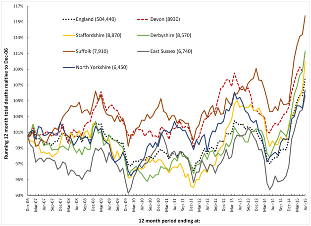
Figure1a. Running 12 month total deaths for six English local authorities and England (total deaths to June-15 in brackets).
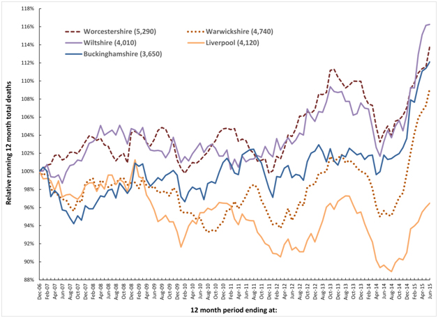
Figure 1b. Running 12 month total deaths for a further five English local authorities (total deaths to June-15 in brackets).
When there is high seasonality in the underlying data (as occurs in deaths, medical admissions and A&E attendances), a running total effectively de-seasonalises the trend and has the advantage of minimising the higher Poisson variation seen in the smaller monthly figures. In a running 12 month total, the onset of a sudden (and unexpected) step-like increase in deaths will create a ramp-like feature.
The point of initiation of the sudden step-up occurs at the foot of the ramp, while the slope of the ramp and the peak 12 months from the foot of the ramp both measure the magnitude of the step-change. When the step-increase eventually abates, a similar ramp down marks the onset of cessation, and this generates the apparent saw-tooth behaviour in the running total of deaths illustrated in Figures 1a and 1b.
Figures 1a and 1b therefore shows a time series of (totally unexpected) step-like increases in death for which there are three key features:
- A series of four step-like events occurring around 2008, 2010, 2012 and 2014.
- Spatiotemporal spread of death revealed by timing differences between initiation in different locations, i.e. differences in onset for the 2010 event between Liverpool and Warwickshire.
- Granularity in the magnitude of the step-increase in that some areas are affected worse than others during the four events, i.e. Wiltshire shows very little response to the 2010 event while there is a very large response in Warwickshire to the 2014 event.
Figure 2 extends this concept and shows running 12 month total trends for all locations in England where there have been corresponding very small area studies of the time-based behaviour of medical admissions during these periods of infectious-like unexplained higher death.
The first study investigated the 2008/09 event, and was conducted in North East Essex (NEE) which comprises Colchester and Tendring, and where patients are admitted at the Colchester University Hospital. In this study, spatiotemporal spread of increased medical admissions were demonstrated during the 2008/09 event which led to a huge overspend in the NEE primary care organisation [35].
Two studies have been conducted in Wigan covering the 2008/09, 2010/11 and 2012/13 events [36,37]. During the 2012/13 event hospital bed occupancy and medical admissions both increased in a spatiotemporal manner leading to capacity problems at the Wigan Royal Infirmary and to an overspend at the Wigan primary care organisation [36].
The final study covered the 2012/13 event across the whole of Berkshire which is represented by Slough (furthest East) and West Berkshire (furthest West) [38]. Severe capacity problems were experienced at the Royal Berkshire Hospital during this event [39]. West Berkshire was observed to be the worst affected while Slough was far lesser affected [38], and this disparity is reflected in Figure 2.
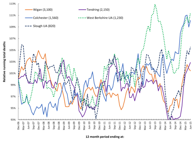
Figure 2. Running 12 month total deaths for three locations where changes in medical admissions have been studied at very small area level.
Unexplained trends in myocardial infarction following hospital admission
As noted in the Introduction in-hospital deaths for many conditions have been declining over time [11,12]. With this in mind, Figure 3 shows the decline in indirectly age-standardized death within 30 days of admission for myocardial infarction (age 35-74), seen for the whole of England between 2003/04 and 2012/13. Over the 10 year time period age-standardized deaths for the whole of England decreased by 38%. Any comparison of particular locations or organisations therefore needs to be against this all-England average – which is also the fundamental basis for hospital mortality models which are re-calibrated each year.
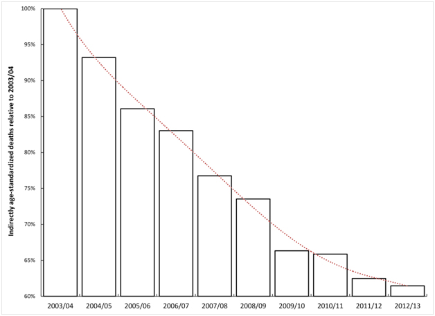
Figure 3. Trend in indirectly age-standardised death within 30 days of admission for myocardial infarction in England.
Figure 4 therefore shows the deviation from the trend for England observed for each of the three very large regions. These largest regions have been chosen simply to avoid any possibility of statistical artefacts, and also to avoid any undue influence from a single hospital. As can be seen all three regions show undulating behaviour which is proposed to arise from spatial spread of the agent responsible for these events and to a time-lag (possibly around one year) before the effect of the agent eventually manifests as an increase in death from myocardial infarction.
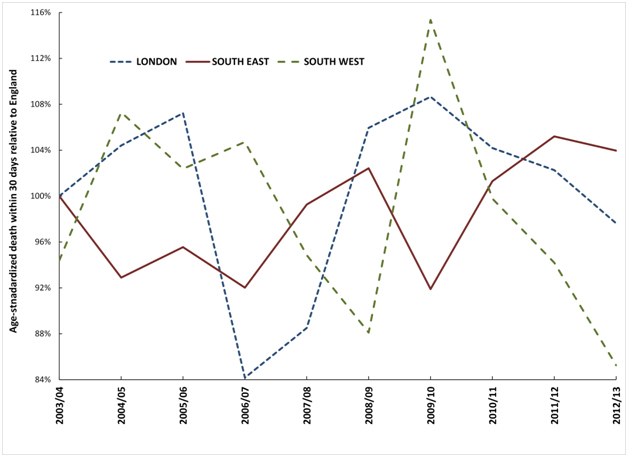
Figure 4. Trend in deviation observed in three large regions from the England age-standardised mortality rate within 30 days of admission for myocardial infarction.
All local authorities, CCGs and NHS Trusts show similar undulating behaviour. For the 140 largest locations/organisations there are two distinct minima in 2004/05 and 2008/09 and two maxima in 2006/07 and 2011/12 in the point where the count of organisations shows the maximum deviation from the trend for the whole of England (Figure 5). Note that this Figure only captures the single point of highest deviation for each organisation, and therefore Figure 5 may miss the 2010/11 event due to its general moderate effect compared to other events [40].
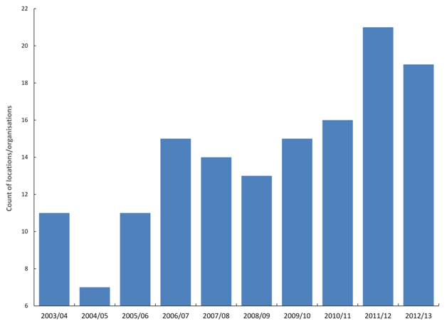
Figure 5. Financial year in which locations/organisations shown maximum deviation from the England trend for age-standardised death from myocardial infarction within 30 days of admission.
In traditional models for ‘excess’ death these maxima and minima represent periods when certain organisations would be flagged as ‘good’ and others as ‘bad’ simply due to the undulating nature of the time trends. Evidence suggests that these mystery events do indeed affect cardiovascular conditions [41].
Whatever your persuasion regarding a link between these events and myocardial infarction, it is still clear that there is spatiotemporal behaviour in death from myocardial infarction subsequent to admission, which also invalidates the hidden assumptions within the hospital mortality models.
Unexplained trends in supposed excess deaths using SHMI
Can it be demonstrated that these events create cycles in the number of supposed excess deaths in particular hospitals? To this end Figure 6a demonstrates cyclic behaviour in the apparent excess deaths calculated using SHMI at Milton Keynes Hospital, while Figure 6b does the same for Ipswich hospital, and 6c repeats the analysis at Northampton hospital – all of which were selected at random, but with the provision that each hospital roughly serviced the population of a single local authority. This assumption holds good for Milton Keynes Hospital but is less so for Ipswich hospital who also draws patients from the fringes of several other local authorities in Sussex, however the approximation is good enough to illustrate the principles. In the case of Northampton hospital, the main hospital catchment lies in the Northampton Unitary Authority, but there are wider flows from parts of Northamptonshire. Hence in Figure 6c both Northampton and Northamptonshire are included for comparison.
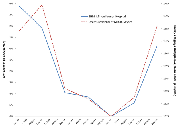
Figure 6a. Cyclic behaviour in the apparent number of excess deaths (SHMI) at Milton Keynes Hospital along with time-matched trend in all-cause mortality for residents of Milton Keynes.
In particular, residents of Milton Keynes were badly affected by the 2014 event, which shows apparent initiation for the whole of Milton Keynes in August/September of 2014 with a large 14% step-like increase in deaths. Hence in Figure 6a the count of apparent excess deaths starts to rise in the 12 month period ending Sep-14 (around 1 to 2 months of the step-change included in the total) and rises even further for the period ending Dec-14 (around 4 to 5 months of step-change included in the total). Likewise the downwards part of the cycle was initiated by the cessation of the 2012 event, which occurred around September 2013. As is evident from Table 2 deaths from Milton Keynes alone are insufficient to explain the totality of hospital deaths, and there are additional flows from Bedfordshire, Stratford-on-Avon and South Northamptonshire.
Hospital/Local Authority |
Jun-13 |
Sep-13 |
Dec-13 |
Mar-14 |
Jun-14 |
Sep-14 |
Dec-14 |
Actual |
Expected |
Actual |
Expected |
Actual |
Expected |
Actual |
Expected |
Actual |
Expected |
Actual |
Expected |
Actual |
Expected |
Milton Keynes Hospital |
1,155 |
1,113 |
1,168 |
1,147 |
1,143 |
1,190 |
1,110 |
1,160 |
1,072 |
1,140 |
1,077 |
1,132 |
1,128 |
1,125 |
Milton Keynes UA |
1,683 |
|
1,704 |
|
1,637 |
|
1,629 |
|
1,615 |
|
1,630 |
|
1,687 |
|
Ipswich Hospital |
1,787 |
1,710 |
1,847 |
1,729 |
1,863 |
1,687 |
1,823 |
1,698 |
1,761 |
1,679 |
1,738 |
1,698 |
1,750 |
1,762 |
Ipswich Borough Council |
1,144 |
|
1,154 |
|
1,175 |
|
1,154 |
|
1,110 |
|
1,132 |
|
1,124 |
|
Northampton Hospital |
1,819 |
1,611 |
1,793 |
1,633 |
1,733 |
1,645 |
1,594 |
1,578 |
1,702 |
1,697 |
1,685 |
1,706 |
1,758 |
1,736 |
Northampton BC |
1,753 |
|
1,717 |
|
1,703 |
|
1,697 |
|
1,665 |
|
1,677 |
|
1,688 |
|
Northamptonshire |
5,962 |
|
5,973 |
|
5,873 |
|
5,788 |
|
5,725 |
|
5,744 |
|
5,874 |
|
Table 2. Actual and expected deaths (SHMI) for each hospital and actual deaths for the surrounding Local Authority areas for the 12 month periods (ending at:).
Hospital/Location |
|
2007/08 Event |
2009/10 Event |
2011/12 Event |
2014/15 Event |
Standard Deviation† |
Initiate |
Increase |
Initiate |
Increase |
Initiate |
Increase |
Initiate |
Increase‡ |
England |
0.1% |
Apr-08 |
2.1% |
Feb-10 |
2.1% |
Feb-12 |
5.0% |
Jun-14 |
9.0% |
Staffordshire |
1.1% |
Oct-07 |
3.2% |
Feb-10 |
2.4% |
Jun-12 |
9.2% |
Oct-14 |
12% |
Royal Derby/East Staffordshire |
3.1% |
Jul-08 |
6.7% |
Feb-10 |
8.6% |
Jun-12 |
13.1% |
Feb-15 |
20% |
Mid Staffordshire/Stafford |
2.8% |
Aug-07 |
9.7% |
Sep-09 |
3.4% |
Jun-12 |
12.7% |
Aug-14 |
15% |
South Staffordshire |
3.0% |
Apr-08 |
7.8% |
Jul-10 |
1.8% |
Jan-12 |
15.2% |
Jul-14 |
7% |
Cannock Chase |
3.4% |
Jan-08 |
10.1% |
Jun-10 |
4.0% |
Feb-12 |
13.1% |
Apr-14 |
10.6% |
Wolverhampton Hospital |
2.3% |
Dec-07 |
7.2% |
Jul-10 |
1.9% |
Feb-12 |
14.0% |
Aug-14 |
10% |
Newcastle-under-Lyme |
2.8% |
Feb-07 |
11.4% |
Jul-10 |
4.0% |
Jun-12 |
6.3% |
Jun-14 |
11.7% |
Staffordshire Moorlands |
3.1% |
Nov-07 |
9.9% |
Oct-09 |
3.9% |
May-12 |
12.8% |
Nov-14 |
18% |
Stoke University Hospital |
2.1% |
Feb-07 |
6.0% |
Feb-10 |
1.5% |
Jun-12 |
8.8% |
Nov-14 |
20% |
Lichfield |
3.2% |
Nov-07 |
9.7% |
Jan-10 |
11.9% |
Sep-12 |
12.5% |
Mar-15 |
25% |
Tamworth |
4.2% |
Jul-08 |
7.4% |
May-10 |
7.5% |
Jul-12 |
8.9% |
Jun-14 |
8.1% |
Good Hope Hospital |
2.5% |
Nov-07 |
6.0% |
Jan-10 |
7.9% |
Aug-12 |
11.0% |
Feb-15 |
13% |
Table 3. Apparent initiation date and percentage increase for four (infectious-like) events in Staffordshire and Staffordshire local authorities, with aggregation of majority flow to particular acute hospitals.
† Standard deviation from Poisson statistics. In a Poisson distribution 85% of all outcomes arising from chance lie below + 1 standard deviation; ‡Whole number percentage values have been estimated using linear regression, while start date was determined by visual inspection of the trend. Methodology as described by Jones & Beauchant [38].
For residents of Ipswich local authority the 2012 event does not finish until Dec-13, hence the decline following this point. Ipswich has a somewhat unique shape for the 2014 event, which commences somewhere around Jun-14, however the running 12 month total deaths does not show a sharp increase until after Dec-14, hence the more jagged trend for all-cause mortality (deaths) in Figure 6b. No doubt creating a spatial area closer to that actually serviced by the hospital (which includes flows from surrounding areas of Suffolk) would bring the SHMI and residents trend lines in closer harmony, however the point has been adequately illustrated.
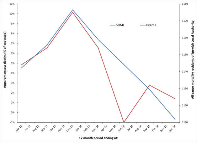
Figure 6b. Cyclic behaviour in the apparent number of excess deaths (SHMI) at Ipswich Hospital along with time-matched trend in all-cause mortality for residents of Ipswich Local Authority.
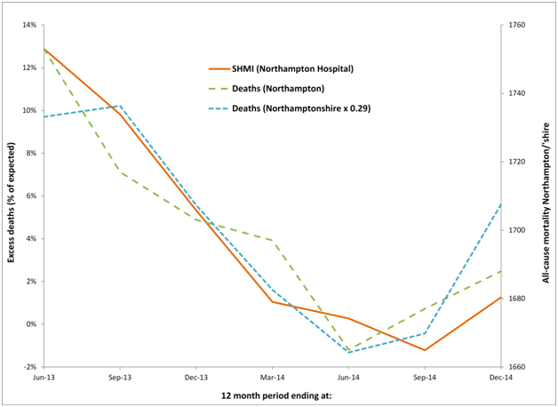
Figure 6c. Cyclic behaviour in the apparent number of excess deaths (SHMI) at Northampton Hospital along with time-matched trend in all-cause mortality for residents of Northamptonshire and Northampton.
Similar comments apply to the Northampton hospital where it can be seen that the running 12 month trend in all-cause mortality for both Northampton and Northamptonshire are roughly similar, although Northamptonshire is roughly three-times larger than Northampton. Given that the standard deviation of a Poisson distribution is equal to the square root of the average number (of deaths) the line for (smaller) Northampton is still very similar to that for (larger) Northamptonshire. See Table 2 for the actual and expected deaths (SHMI) at each hospital and the actual deaths in each of the associated Local Authority areas.
Hence for three hospitals selected at random, whatever the SHMI model for hospital mortality is measuring, it is clearly heavily influenced by the unexplained events leading to national and international periods of higher deaths and medical admissions.
Unexplained trends in supposed excess deaths using HSMR
Due to the differences between SHMI and HSMR highlighted in Table 1 it is possible that one method may be affected more so than the other. Very small area spatial spread of the potential infectious agent which appears to affect all-cause mortality has already been demonstrated within the borough of Wigan (Greater Manchester) [36,37], and both HSMR (in-hospital deaths at the Wigan and nearby Wrightington hospital), and all-cause mortality data for the residents of Wigan are therefore presented in Figure 7. As can be seen an almost identical situation applies for HSMR as has already been demonstrated for SHMI in Figures 6a to 6c. On this occasion, over 95% of hospital admissions are from the borough of Wigan, and flows from elsewhere are therefore not of material importance.
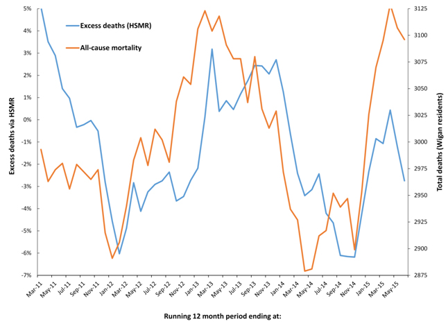
Figure 7. Cyclic behaviour in the apparent number of excess deaths (HSMR) at Wrightington and Wigan hospitals along with time-matched trend in all-cause mortality for residents of the borough of Wigan.
The outbreaks and evaluation of deaths in Mid Staffordshire
Using HSMR it has been claimed that between 2005 and 2008 there were somewhere up to 1,200 excess deaths at the Mid Staffordshire Analysis of the entire time period is restricted by the fact that the monthly ONS Mortality Series DR only commences in 2006. This time range is sufficient to conduct some analysis around the time of the 2008 event.
On this occasion data from all Staffordshire Local Authorities has been examined due to geographic proximity, which would exclude any effects on mortality based on temperature or other metrological differences. The Mid Staffordshire hospital was situated in the city of Stafford which is at the geometric centre of the borough of Stafford. All other Staffordshire local authorities form a rough ring around the borough of Stafford, except for Tamworth which is closest to Birmingham.
For each of the Staffordshire local authority areas only the Stafford unitary authority had 100% flow to the Mid Staffordshire hospital. Both Newcastle-under-Lyme, and Staffordshire Moorlands flow to the Royal Stoke University Hospital; Litchfield and Tamworth mainly flow to the Good Hope Hospital in Sutton Coldfield; East Staffordshire mainly flows to the Royal Derby Hospital; South Staffordshire mainly flows to the Royal Wolverhampton Hospital; while Cannock Chase has a mixed flow to Mid Stafford and Royal Wolverhampton Hospitals, but with a majority flow to Royal Wolverhampton. Hence it is only the Stafford unitary authority residents which should experience any major effect from excess death at Mid Staffordshire hospital.
Table 3 presents the initiation date and percentage increase in deaths for each of the four infectious-like events since 2006, and this illustrates the general principle of spatial spread of the agent and high granularity in the effect against deaths. As can be seen the majority of step-like increases arising from the infectious-like events cannot have arisen from chance, except for several occasions relating to the 2009/10 event. This particular event showed particularly dispersed small-area initiation [37,40].
Figure 8 analyses the running 12 month trends in deaths for the local authority areas in Staffordshire from Dec-06 to May-14, however local authority areas have been combined to reflect the major flow to the different hospitals. Data for the whole of Staffordshire and England are also included. Interestingly the whole of Staffordshire lies very close to the trend experienced for the whole of England, while individual LAs in Staffordshire show wide variation. The implications of these findings are covered in the discussion.
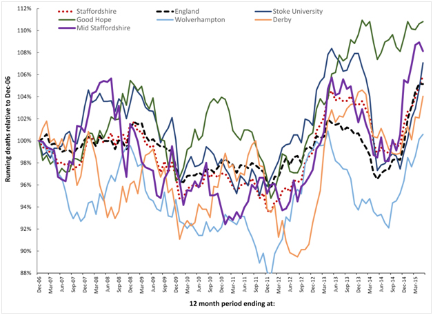
Figure 8. Running 12 month total deaths for Local Authorities in Staffordshire aggregated to the majority flow to the nearest acute Hospital. See Table 2 for more detail regarding initiation date and magnitude of the step-change for each of the four (infectious-like) events illustrated in this time frame.
Discussion
Background to the events
This curious behaviour is replicated across all Western countries, and at roughly the same time [43]. Even more importantly, it is during these extended periods of unexplained high death that medical admissions [22,33,35,44], A&E attendances [33,35,44], hospital bed occupancy [39,45], inpatient length of stay [46], GP referral and ratio of follow-up to first outpatient attendances [47,48], sickness absence [34], and healthcare costs [49] all show synchronous change. There is also a wobble in the gender ratio at birth [50]. The 2012 event led to a reversal in the increase in life expectancy [51], and an unexplained and large increase in deaths for those with neurological disorders [52]. In response to attention from the press, Public Health England ‘explained away’ the deaths as excess winter mortality [53]. Excess winter mortality does not create the inverted ‘V’ profile seen in a running 12 month total chart, and has been dismissed as an explanation for the periods of higher unexplained deaths also observed in Australia [54].
Deaths show roughly a one to two month lag behind the increase in A&E attendances and medical admissions, i.e. initial illness precedes eventual death [22,44]. However, all who are affected do not die, and there are approximately 10 extra medical admissions per death [55].
There is evidence for these events stretching back to the 1950’s [40], where it can be seen that they usually occur only twice per decade, except for a series at close interval in the 1990’s (1993, 1996. 1999, 2002), and more recently as per Figure 1. The 1993 event provoked a large rise in medical admissions which spread across the whole of the UK, and elicited a lively debate in the BMJ as to what was happening (see reviews [21,22,33,49]). No one thought to look for evidence of spatial spread, and the de facto conclusion was that the problem lay with the health services [21,22,33,49]. The macroscopic spread between local authorities (Figure 1) is matched by even more complex very small area spread within a local authority [35-38], and a time cascade for death due to different conditions within hospitals [36,39]. Analysis of previous events suggests that the cost of cancer treatment is differentially affected between primary care organisations [56]. Extrapolation of the magnitude of the effect back to a small social network containing an average of one death per annum reveals a maximum possible 300% increase in death during the events – although the maximum occurs infrequently [43].
This appears to be some new type of infectious phenomena, however, whatever the cause it is the timing differences, and differences in magnitude of the effect between locations, which suggests that the current models for hospital death have a large and hidden flaw which will affect the calculated excess mortality in different locations and at different times. Indeed it has also been proposed that these events may interfere with the process of age-standardisation which traditionally uses 5 year age bands [38,57], and is employed in most comparative health care analysis, including the models for hospital mortality.
Spatial synchrony
All infectious events display variable degrees of synchrony, i.e. the degree to which the outbreak clusters in time. Figures 1a, 1b, 2, and 8 show abundant evidence for different degrees of synchrony in each of the events. In particular, the 2014 event appears to show higher synchrony than previous events [34], and this is especially noted in the trend line for the whole of England. It is now known that the 2010/11 event displayed low synchrony with moderately even spread over a two year period [37]. This slow spread leads to the effect in small areas cancelling each other out leading to the almost absence of an ‘apparent’ effect in larger geographies such as in Figures 1a, 1b and 2.
The 2014 event in Milton Keynes appears to show high synchrony within the whole of Milton Keynes leading to the relatively large 14% step-like increase in all-cause mortality with knock-on effects against apparent in-hospital mortality seen in Figure 6a.
It is not unknown for different strains of the same agent along with regional climate variability to initiate variable spatiotemporal effects during respective outbreaks [58].
Spatial synchrony is an implicit assumption within hospital mortality models and this synchrony forms the basis for comparison against the all-England’ average’ as a valid benchmark. Figures 1a and 8 included the England ‘average’ position for all-cause mortality to demonstrate how these events do indeed create imperfect synchronous patterns relating to each event. See discussion regarding Mid Staffordshire hospital relating to a lack of synchrony in the 2007/08 event.
How does the ‘flaw’ affect the models?
In order to process the 9,000 or so ICD-10 diagnoses commonly used by the UK National Health Service (NHS) the mortality models must, of necessity, collapse these to a more manageable set of ‘roughly’ similar diagnoses contained in 259 Clinical Classification Software (CCS) groups [59]. The hidden assumptions within the CCS groups are threefold:
- That the case mix in each group has a roughly similar risk of death, including age specificity
- That local case mix is roughly similar to the national average case mix within each CCS group
- That spatiotemporal events do not alter the relative balance between admissions and death, i.e. the risk of death in particular diagnoses
From the available research it is clear that large spatiotemporal effects are occurring and that particular diagnoses, seemingly sensitive to immune function (i.e. infection, inflammation and autoimmunity) [21,22,33,39], are differentially affected. Point #1 above is obviously invalidated in the real world, and this is especially apposite relating to point #2, since it is known that the case-mix and age profile in outpatients [47,60], the ED [61], and inpatients [22,33] changes markedly during these events.
Regarding #3 it would seem that for some diagnoses death is affected more than admissions, and vice versa, and that in some of the events admissions are affected more than deaths [22].
The models are therefore at risk of generating flawed outcomes depending on the timing and extent to which each location is affected in relation to the national average. Hence the rationale for comparison against national average in Figures 3, 4 and 8.
Are hospitals responsible for the trend in deaths?
In the UK somewhere less than 50% of deaths occur in-hospital [62], and on this basis alone it would take vast increases in in-hospital deaths to influence all-cause mortality. More importantly the unexplained increases in all-cause mortality occur roughly synchronously throughout the Western world [43], and this strongly argues against a particular effect associated only with English hospitals.
Clearly, it is the hospitals which are effected by the primary aetiology behind the changes in all-cause mortality rather than vice versa.
Differential sensitivity of HSMR and SHMI
As has been presented in Table 1 there are major differences between the two models used in the UK for the evaluation of excess hospital mortality. The key difference lies in the range of diagnoses and how these diagnoses are aggregated into groups. It has already been pointed out that these unusual events result in significant shifts in the diagnoses associated with hospital admission [33,35,63,64], and all-cause mortality [39,52,64,65]. In this respect HSMR contains a more limited range of common diagnoses which are aggregated in a less granular fashion than in SHMI. Figures 6a, 6b and 6c have used SHMI simply because the data is publically available, however, based on the above considerations SHMI may be more sensitive to these infectious-like events than HSMR. If such a difference does exist, Figure 7 seems to indicate that it is not of material importance, i.e. both hospital mortality models appear to be seriously compromised.
Statistical considerations
In the absence of linked biochemical and vital signs data, both HSMR and SHMI rely on statistically derived correlations with routinely available hospital data. It goes without saying that some of the hidden assumptions within correlation, namely that the data is equally spaced, will be invalidated, and that the correlations will be heavily skewed to the coding in the largest hospitals, which by definition will be mostly teaching hospitals. Issues around coding are known to make a major contribution to the apparent HSMR at different hospitals [66].
As has been pointed out the infectious-like events affecting hospital admission and all-cause mortality occur at different times (most commonly twice per decade), and the financial year chosen to validate the model is likely to have a material effect on the resulting hidden interactions between administrative parameters. Both HSMR and SHMI were constructed using data from different financial years, HSMR using data from 1996/97 onward, and SHMI using data from 2005/06 to 2009/10, i.e heavily influenced by the 2008 event.
The statistical significance of the increase in medical admissions and deaths associated with these events has been consistently demonstrated in other studies [35-38]. Rather than repeat this proof throughout this article, Table 3 gives indicative values for the standard deviation associated with the step-increase in deaths seen throughout Staffordshire. Recall that in a Poisson distribution 85% of values lie below +1 standard deviation. Also recall that due to the unique kinetics behind the spread of this infectious-like agent that apparent magnitude of the increase in deaths diminishes rapidly as size increases [38,43,54].
Data in Figure 4 was deliberately chosen for three very large regions for two reasons
- The small-area spatial spread of the agent responsible for these infectious-like events is known to create apparent regional differences in both initiation and percentage increase [53]
- The three regions contain multiple hospitals thereby avoiding hospital-specific effects, and avoiding small-number effects
Finally, the three hospitals chosen at random in Figures 6a, 6b and 6c present a case of the same behaviour replicated in different locations, but with slightly different timing. Irrespective of the arguments around whether the trends are statistically significant it still remains that all three behave in a consistent manner with respect to SHMI (as does Figure 7 with respect to HSMR), and with the wider studies regarding the infectious-like spread of the agent which modifies both admissions, ED attendances and deaths [38-40,49,54,55].
It must also be pointed out that the apparent cycle seen in Figures 6a, 6b and 6c, and again in Figure 7, is an artefact of the step-down following the cessation of the 2012 event and the step-up in deaths associated with the initiation of the 2014 event, i.e. in a running 12 month total chart a step-change creates a ramp. Almost all users of HSMR and SHMI are unaware of this time-based effect on the apparent value of excess mortality.
2021 Copyright OAT. All rights reserv
Did the outbreaks influence events at mid-Staffordshire hospital
As indicated in the introduction, it was the mid-Staffordshire hospital scandal which gave impetus to the wider application of HSMR and SHMI in the UK. In order to achieve Foundation Trust status along with associated prestige and greater financial freedom, the management curtailed expenditure on staff leading to poor patient to staff ratios [1], which are a known cause of poor patient outcomes [29,30]. However the subsequent review (the Francis report), was conducted in the absence of any knowledge of the potential contribution of these infectious-like events to both all-cause mortality, and thus to in-hospital mortality. HSMR was consistently high at this hospital between 2003/04 and 2007/08, with quarterly HSMR ranging from 20% to 60% above national average [42].
My own investigation of the 2008 event (2008 is the calendar year in which deaths peak across the whole UK), show potential earliest initiation in Scottish Local Authorities around Jan-05 (range Jan-05 to Oct-08, median Jan-07), while in Northern Ireland initiation ranges from Apr-06 to Oct-08, with an earlier and a later wave. The whole of England shows an apparent initiation date around Apr-08 (versus Scotland around Apr-06). This concurs with a rather staggered initiation for this event across the whole of Europe [49]. Hence the question remains if somewhat earlier initiation in Stafford (Table 3 and Figure 8) compared to the rest of England may have contributed to seeming overestimation against the all-England average. However this cannot explain the higher HSMR at this hospital observed from 2003/04 onward – although the timing of the 2003 event may have made an additional contribution.
The sudden step-like increase in admissions associated with these events [35-39], simply overwhelms available nursing (and coding) resources. Hence in somewhere like the Mid Staffordshire Hospital, where staff were already stretched, the impact would be even greater, and avoidable deaths are likely to have occurred.
The final answer will never be known, since the Mid Staffordshire hospital had changed its coding processes throughout the time span, partly in an attempt to compensate for the poor HSMR. Hence timing differences for both the 2003 and 2008 events may have made some contribution to the estimated excess deaths, although it is clear that poor practice played a major factor.
Conclusion
From whichever viewpoint you choose to take, there is evidence for unexpected spatiotemporal behaviour affecting both death and admissions which invalidates the fundamental assumptions behind hospital mortality monitoring in general. This flaw is unlikely to have a major effect on the calculated value of the “weekend effect” observed in hospital mortality [67], simply because the comparison in that instance is between days of the week rather than between locations/organisations, and over longer time frames.
Moving away from the limitations of hospital mortality models exposed in this study, it has also been estimated that each event leads to a minimum of £600 million of unexpected cost pressures on the NHS in England [49]. This point is most apposite given current very high levels of deficit alongside two recent and large events in 2012 and 2014 (whose effects are still currently ongoing). The politically-correct story, that the NHS is to blame, and needs all manner of corrective interventions, may not be entirely correct. Something far more concerning than the “weekend effect” may be at play. To their shame, politicians and policy makers seem more ready to continue blaming the NHS rather than acknowledging that something entirely unexpected is happening.
Funding, conflict of interest and patient consent
There were no sources of funding. The author is not aware of any conflicts of interest. No patient consent was required for this study.
References
- Francis report on Mid Staffs: government accepts recommendations. https://www.gov.uk/government/news/francis-report-on-mid-staffs-government-accepts-recommendations
- Aylin P, Bottle A, Jen M, Middleton S (2009) HSMR mortality indicators. http://www.nhs.uk/NHSEngland/Hospitalmortalityrates/Documents/090424%20MS(H)%20-%20NHS%20Choices%20HSMR%20Publication%20-%20Presentation%20-%20Annex%20C.pdf
- Campbell M, Jacques R, Fotheringham J, Pearson T, Maheswaran R, et al. (2011) An evaluation of the summary hospital mortality index. http://www.sheffield.ac.uk/polopoly_fs/1.51777!/file/SHMI_Final_Report.pdf
- Campbell MJ, Jacques RM, Fotheringham J, Maheswaran R, Nicholl J (2012) Developing a summary hospital mortality index: retrospective analysis in English hospitals over five years. BMJ 344: e1001. [Crossref]
- Pouw M, Peelen L, Moons K, Kalkman C, Lingsma H (2013) Including post-discharge mortality in calculation of hospital standardised mortality ratios: retrospective analysis of hospital episode statistics. BMJ 347: f5913. [Crossref]
- Flowers J, Abbas J, Ferguson B, Jacobson B, Fryers P (2010) Dying to know. How to interpret and investigate hospital mortality measures. Association of Public Health Observatories, UK.
- Alexandrescu R, Bottle A, Jen M, Jarman B, Aylin P (2015) The US hospital standardised mortality ratio: Retrospective database study of Massachusetts hospitals. J Roy Soc Med Open 6: 1-8. [Crossref]
- Hogan H, Zipfel R, Neuburger J, Hutchings A, Darzi A, Black N (2015) Avoidability of hospital deaths and association with hospital-wide mortality ratios: retrospective case record review and regression analysis. BMJ 351: h3239. [Crossref]
- Girling A, Hofer T, Wu J, Chilton P, Nicholl J, et al. (2012) Case-mix adjusted hospital mortality is a poor proxy for preventable mortality: a modelling study. BMJ Qual Saf 21: 1052-1056. [Crossref]
- Clark D, Armstrong M, Allan A, Graham F, Carnon A, et al. (2014) Imminence of death among hospital inpatients: Prevalent cohort study. Palliative Medicine 28: 474-479. [Crossref]
- Hall M, Levant S, DeFrances C (2013) Trends in inpatient hospital deaths: National hospital discharge survey, 2000-2010. National Center for Health Statistics, HCHS Data Brief No. 118 Hyattsville, MD, USA.
- Aragon M, Chalkey M (2014) Understanding the differences in in-hospital mortality between Scotland and England. Centre for Health Economics, University of York, UK.
- Cohen A, Milot E, Li Q, Bergeron P, Poirier R, et al. (2015) Detection of a novel, integrative aging process suggests complex physiological integration. PLOS One 10: e0116489. [Crossref]
- Xu M, Tam B, Thabane L, Fox-Robichaud A (2015) A protocol for developing early warning score models from vital signs data in hospitals using ensembles of decision trees. BMJ Open 5: e008699. [Crossref]
- O’Sullivan E, Callely E, O’Riordan D, Silke B (2012) Predicting outcomes in emergency medical admissions – role of laboratory data and co-morbidity. Acute Med 11: 59-65. [Crossref]
- Bo M, Massaia M, Raspo S, Bosco F, Cena P, et al. (2003) Predictive factors of in-hospital mortality in older patients admitted to a medical intensive care unit. J Am Geriat Soc 51: 529-533. [Crossref]
- Horne BD, May HT, Muhlestein JB, Ronnow BS, Lappe DL, et al. (2009) Exceptional mortality prediction by risk scores from common laboratory tests. Amer J Med 122: 550-558. [Crossref]
- Mohammed M, Rudge G, Wood G, Smith G, Nangalia V, et al. (2012) Which is more useful in predicting hospital mortality – dichotomised blood test results or actual test values? A retrospective study in two hospitals. PLOS One 7: e46860. [Crossref]
- Kellett J, Deane B (2006) The simple clinical score predicts mortality for 30 days after admission to an acute medical unit. Q J Med 99: 771-781. [Crossref]
- Jones R (2015) Re: Avoidability of hospital deaths and association with hospital-wide mortality ratios: retrospective case record review and regression analysis. BMJ 351: h3239.
- Jones R (2013) Widespread outbreaks of a subtle condition leading to hospitalization and death. Epidemiology: Open access 4: 137.
- Jones R (2016) Is cytomegalovirus involved in recurring periods of higher than expected death and medical admissions, occurring as clustered outbreaks in the northern and southern hemispheres? Brit J Med Medical Res 11: 1-31.
- Mitnitski A, Collerton J, Martin-Ruiz C, Jagger C, von Zglinicki T, et al. (2015) Age-related frailty and its association with biological markers of ageing. BMC Med 13: 161. [Crossref]
- Hunziker S, Stevens J, Howell M (2012) Red cell distribution width and mortality in newly hospitalized patients. Amer J Med 125: 283-291. [Crossref]
- Stenholm S, Kivimaki M, Jylha M, Kawachi I, Westerlund H, et al (2015) Trajectories of self-rated health in the last 15 years of life by cause of death. Eur J Epidemiol 30: in press.
- Gagne JJ, Glynn RJ, Avorn J, Levin R, Schneeweiss S (2011) A combined comorbidity score predicted mortality in elderly patients better than existing scores. J Clin Epidemiol 64: 749-759. [Crossref]
- Quan H, Li B, Couris C, Fushimi K, Graham P, et al. (2011) Updating and validating the Charlson Comorbidity Index and score for risk adjustment in hospital discharge abstracts using data from 6 countries. Am J Epidemiol 173: 676-682. [Crossref]
- Ajetunmobi O, Taylor M, Stockton D, Wood R (2013) Early death in those previously hospitalized for mental healthcare in Scotland: a nationwide cohort study, 1986-2010. BMJ Open 3: e002768. [Crossref]
- McHugh M, Kelly L, Smith H, Wu E, Vanak J, et al. (2013) Lower mortality in magnet hospitals. Med Care 51: 382-388. [Crossref]
- Needleman J, Buerhaus P, Pankratz S, Leibson C, Stevens S, et al. (2011) Nurse staffing and inpatient hospital mortality. New Engl J Med 364: 1037-1045. [Crosssref]
- Asthana S, Gibson A (2013) Acute care: The real reason for ‘failing’ hospitals. Health Service Journal 123: 20-22.
- Servedio MR, Brandvain Y, Dhole S, Fitzpatrick CL, Goldberg EE, et al (20140 Not Just a Theory—The Utility of Mathematical Models in Evolutionary Biology. PLoS Biol 12: e1002017. [Crosssref]
- Jones R (2013) Could cytomegalovirus be causing widespread outbreaks of chronic poor health? In Hypotheses in Clinical Medicine, Eds M. Shoja, et al. New York: Nova Science Publishers Inc. pp 37-79.
- Jones R (2015) Are emergency admissions contagious? Brit J Healthc Manage 21: 227-235.
- Jones R (2015) Infectious-like spread of an agent leading to increased medical hospital admission in the North East Essex area of the East of England. FGNAMB 1: in press.
- Jones R (2014) Infectious-like Spread of an Agent Leading to Increased Medical Admissions and Deaths in Wigan (England), during 2011 and 2012. Brit J Med Medical Res 4: 4723-4741.
- Jones R (2015) Small area spread and step-like changes in emergency medical admissions in response to an apparently new type of infectious event. FGNAMB 1: 42-54.
- Jones R, Beauchant S (2015) Spread of a new type of infectious condition across Berkshire in England between June 2011 and March 2013: Effect on medical emergency admissions. Brit J Med Medical Res 6: 126-148.
- Jones R (2015) Unexpected and Disruptive Changes in Admissions Associated with an Infectious-like Event Experienced at a Hospital in Berkshire, England around May of 2012. Brit J Med Medical Res 6: 56-76.
- Jones R (2015) A previously uncharacterized infectious-like event leading to spatial spread of deaths across England and Wales: Characteristics of the most recent event and a time series for past events. Brit J Med Medical Res 5: 1361-1380.
- Jones R (2015) A new type of infectious outbreak? SMU Medical Journal 2: 19-25.
- How many people died “unnecessarily” at Mid Staffs? https://fullfact.org/factchecks/francis_many_deaths_unnecessarily_at_mid_staffs-28805
- Jones R (2015) Deaths and international health care expenditure. Brit J Healthc Manage 21: 491-493.
- Jones R (2013) A recurring series of infectious-like events leading to excess deaths, emergency department attendances and medical admissions in Scotland. Biomedicine International 4:72-86.
- Jones R (2015) Bed occupancy, efficiency and infectious outbreaks. Brit J Healthc Manage 21: 396-397.
- Jones R (2015) Is length of stay a reliable efficiency measure? Brit J Healthc Manage 21: 344-345.
- Jones R (2012) Increasing GP referrals: collective jump or infectious push? Brit J Healthc Manage 18: 487-495.
- Jones R (2012) Trends in outpatient follow-up rates, England 1987/88 to 2010/11. Brit J Healthc Manage 18: 647-655.
- Jones R (2015) Recurring Outbreaks of an Infection Apparently Targeting Immune Function, and Consequent Unprecedented Growth in Medical Admission and Costs in the United Kingdom: A Review. Brit J Med Medical Res 6: 735-770.
- Jones R (2013) Do recurring outbreaks of a type of infectious immune impairment trigger cyclic changes in the gender ratio at birth? Biomedicine International 4: 26-39.
- Jones R (2015) Recent trends in life expectancy at older ages. Healthcare Analysis & Forecasting, Camberley, UK.
- Jones R (2015) Unexpected Increase in Deaths from Alzheimer’s, Dementia and Other Neurological Disorders in England and Wales during 2012 and 2013. J Neuroinfectious Dis 6:172.
- Jones R (2013) Analysing excess winter mortality: 2012/13. Brit J Healthc Manage 19: 601-605.
- Jones R (2015) A time series of infectious-like events in Australia between 2000 and 2013 leading to extended periods of increased deaths (all-cause mortality) with possible links to increased hospital medical admissions. International Journal of Epidemiologic Research 2: 53-67.
- Jones R (2015) Unexplained infectious events leading to deaths and medical admissions in Belfast. Brit J Healthc Manage 21: 46-47.
- Jones R (2012) Cancer care and volatility in commissioning. Brit J Healthc Manage 18: 315-324.
- Jones R (2014) Unexpected single-year-of-age changes in the elderly mortality rate in 2012 in England and Wales. Brit J Med Medical Res 4: 3196-3207.
- de Magny G, Guégan J-F, Petit M, Cazelles B (2007) Regional-scale climate-variability synchrony of cholera epidemics in West Africa. BMC Infect Dis 7:20. [Crossref]
- Care Quality Commission (2013) CQC indicators for mortality and emergency readmissions using Hospital Episode Statistics (HES), http://www.cqc.org.uk/sites/default/files/documents/nhs_hes_qrp_data_item_guidancefor_publication.pdf
- Jones R (2014) Unexpected changes in outpatient first attendance. BJHCM 20: 142-143.
- Jones R (2014) What is happening in unscheduled care? J Paramed Practice 5: 60-62.
- Jones R (2012) End of life care and volatility in costs. Brit J Healthc Manage 18: 374-381.
- Jones R (2015) An unexpected increase in adult appendicitis in England (2000/01 to 2012/13): Could cytomegalovirus (CMV) be a risk factor? British Journal of Medicine and Medical Research 5: 579-603.
- Jones R (2014) A Study of an Unexplained and Large Increase in Respiratory Deaths in England and Wales: Is the Pattern of Diagnoses Consistent with the Potential Involvement of Cytomegalovirus? British Journal of Medicine and Medical Research 4: 5179-5192.
- Jones R (2014) Increased deaths in 2012: which conditions? Brit J Healthc Manage 20: 45-47.
- Van den Bosch W, Silberbusch T, Roozendaal K, Wagner C (2010) Variation in patient data coding affect hospital standardized mortality ratio (HSMR). Nederlands Tijdschrift Voor Geneescunde 154: A1189 [Abstr, Trans].
- Freemantle N, Ray D, McNulty D, Rosser D, Bennett S, et al. (2015) Increased mortality associated with weekend hospital admission: a case for expanded seven day services? BMJ 351:h4596